Which of These 14 Website Mistakes are RUINING Your Conversions and Costing You SERIOUS Money in Lost Profits?
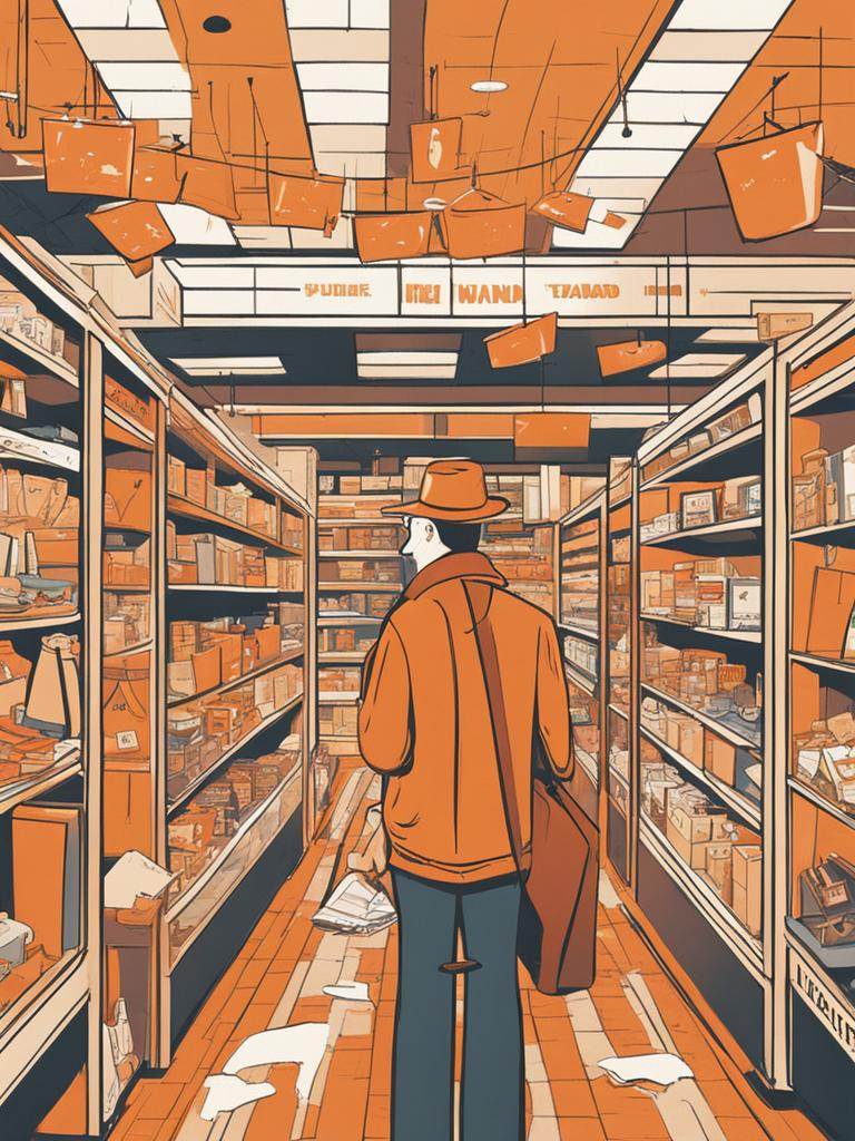
I was walking down a bustling city street when it caught my eye: A weathered sign tucked within a narrow alley, barely visible from the street. “Carlo’s Store,” it read. Intrigued, I ventured into the alley.
Not knowing what to expect or if I was even welcome, I slowly pushed open the door. Flickering fluorescent lights assaulted my eyes. The aisles were cluttered with a hodge podge of dusty objects, and blaring carnival music reminded me of a frequent childhood nightmare.
Any lingering curiosity evaporated quicker than a raindrop in the Sahara and I quickly fled the store.
Not exactly an inviting experience, right? The same applies to websites. Problems like slow loading times, confusing navigation, and broken links create friction for visitors, hindering their journey from browsing to buying.
Removing these problems isn’t just about creating a smoother experience; it’s about boosting conversions and maximizing your website’s potential.
Remember, your website is your digital storefront. By diligently removing problems and creating a smooth, enjoyable experience, you pave the way for increased conversions and ultimately, business success.
Guaranteed, your website is making at least one of these mistakes, if not several.
And it’s costing you money every single day you don’t fix it.
Let’s get started…
1: Meaningless Homepage Headers
Imagine you walk into a store, totally lost. You don’t have a clue what they do or what they sell. You don’t know why you’re there, and you’re thinking maybe you better leave.
That’s what happens to your visitors when your website’s homepage has a confusing main message. For example, “We’re the best.” At what? Visitors are left scratching their heads and clicking away faster than you can say “website bounce.”
Here’s the deal: Your homepage headline is like the giant neon sign outside your store. It needs to be clear, loud, and tell everyone exactly what you’re selling. We’ve all seen plenty of vague stuff like “We love ourselves because we’re the greatest thing ever.” Or worse yet, “Harnessing the transformative power of disruptive technologies, we champion paradigm shifts within the healthcare ecosystem. Our mission: facilitate seamless transitions towards uncharted territories, unlocking a future optimized for collective well-being.”
Ugh.
Instead, be upfront: “Revolutionizing healthcare with AI-powered medical magic.”
See the difference? Now people know you’re all about fixing their medical woes with fancy tech.
And it’s not just about bragging. Tell them why they should care: “Get faster diagnoses, ditch paperwork stress, and spend more time feeling healthy.” Now they’re hooked, picturing a life free from medical hassles.
Remember, attention spans are shorter than a goldfish these days. Keep your message short, sweet, and scannable.
Think you nailed it? Then it’s time for the “Five Second Test”: Show people your homepage for 5 seconds, ask them what you do, and if they’re clueless, go back to the drawing board.
Ditch the mystery, speak their language, and watch your website transform from a confusing store to a customer magnet.
2: Confusing Navigation Labels
Imagine you walk into a store with signs saying “Stuff,” “More Stuff,” and “Other Stuff.” Confused, right? That’s how visitors feel when your website menu uses vague labels like “Products” and “Services.” They have no idea what you offer, so they click away faster than a cheetah chasing lunch.
Here’s the fix: Make your navigation labels clear and specific. Instead of “Products,” use “Running shoes” or even “High-performance running shoes for every terrain.” Now, runners know exactly where to click and everyone else will look for the label that applies to them.
Think of it as a roadmap: Each label guides visitors deeper into your site, where they find exactly what they need. Vague labels leave them lost and frustrated, while specific ones point them in the right direction.
Remember, the goal is to get visitors off the homepage. The more they click, the more you learn about their needs and can help them. When they click “Chronometers,” you know they’re serious about timekeeping, not just browsing “Stuff.”
3: Non-Specific Subheads
Remember that awkward first date where you just exchanged generic pleasantries? “Nice weather today, isn’t it?” That’s what your website feels like with vague subheads. They offer nothing of substance, leaving visitors confused and search engines clueless.
Instead of being that awkward date, craft subheads that grab attention and guide visitors deeper into your website. Here’s how:
- Ditch the jargon: “Our Solutions” says nothing. Instead, say “Empowering doctors with AI-powered diagnosis tools.” Now visitors know exactly what you offer.
- Think mini-headlines: Each subhead should tell a mini-story about the section below. Think of it as a roadmap, guiding visitors to the information they need.
- Make it short and sweet: No one wants to read a novel in a subhead. Keep it concise and impactful.
- SEO boost: Subheads are H2 tags, prime real estate for relevant keywords. Use them wisely to tell search engines what your page is about.
- Focus on benefits, not just features: Don’t just tell them what you do, tell them how it improves their lives.
- Don’t bury the good stuff: If you have powerful testimonials, bring them above the fold with clear subheads.
Clear communication is key. Rewrite your subheads and watch your website transform into a conversion machine.
4: Slideshows
Should your website have a slideshow? The short answer is no, the longer answer is “No freakin’ way,” and the right answer is, “Maybe, maybe not.”
Confused? So is everyone else. About 40% of websites still use slideshows. But as your mother would say, “If your friends jump off a bridge, would you do it, too?”
Here’s why some marketers still like slideshows:
- Info Stacking: They’ve got a lot to say and limited homepage space to say it. If you’ve got 10 awesome things to showcase on your website, but only one spot to show them, then a slideshow lets you cycle through them, like a mini-commercial.
- Indecision: What if you can’t decide which message is most important? Slide them all into the slideshow and you won’t have to decide.
And here’s why some marketers hate slideshows:
- It’s Too Much: Shiny things moving everywhere can be distracting, like a hyperactive squirrel on caffeine. It takes away from the main message you actually want people to see.
- It Doesn’t Work: Most people only see the first slide anyway, so putting your coolest stuff on slide 4 is like hiding it under a pile of blankets.
- Missed It: Let’s say someone does sit through your 10-point slideshow. BOOM. They see what they want on slide #8, but now it’s gone, and the show is on slide #9. If the visitor can’t figure out how to get back to #8 then they’re going to have to sit through the entire slideshow again and then be quick enough to click the correct slide before it disappears again. Seriously, how many visitors will endure this treatment?
What to do instead:
- Keep it simple: Think of your homepage as a billboard. Make it clear what your website is all about in a few words, something someone could understand in 5 seconds.
- Save the extras for later: More messages? Put them lower down the page, where people can explore at their own pace.
- Slideshows? Maybe, but be careful: If your offer needs pictures to shine and the messages are all similar, a slideshow might work like a cool photo gallery. But remember, most people only see the first slide, so make it count.
Bottom line: Less is often more. When in doubt, nix the slideshow.
5: Stock Photos

From the time they are babies until the day they die, people are mesmerized by pictures of faces. Pictures of people are powerful magnets, drawing viewers in and building connections, and that’s why they’re essential for your website.
But not just any photos will do. Stock images with their fake smiles and staged scenarios feel phony as a three-dollar bill. People see right through them and move on, missing the chance to connect with you.
Don’t let stock photos be your downfall. Here’s why they’re bad news:
- They’re forgettable: We’ve all seen the fake handshake or forced laughter countless times. They blend in, unnoticed, like wallpaper.
- They lack authenticity: No amount of Photoshop can create a genuine connection. Users crave real people, with real stories.
So, what’s the solution?
Real photos, baby. Invest in professional photography or get creative with your team. Show the faces behind your brand, and watch the magic happen.
Real photos grab attention and stop users in their tracks.
Real photos build trust, making your brand feel relatable and approachable.
Real photos tell stories because a genuine smile, thoughtful expression, or goofy face speaks volumes about your business.
Bottom Line: The WORST photos you take will still be better than the best stock photography you can buy.
6: Social Media Buttons
You wouldn’t interrupt a friend telling you a story by asking them to share it, right? So why do websites do the same with social media widgets on sales pages?
It’s like flashing a neon sign saying “Hey, leave this important information and go check out our Facebook page instead.”
Not exactly persuasive, is it?
Flashy icons and pop-ups pull attention away from your sales message, making it harder for visitors to focus on what matters – your product or service.
Social media icons encourage them to leave your sales page before they even consider buying.
Social icons in headers are prime real estate, but they’re being used to lead visitors away. Put your most important information there instead.
Remember, visitors on your sales page are your most valuable customers. Don’t push them away with social media distractions.
You can still have your social media buttons – just move them to the footer. This way they’re accessible, but not in the way.
You can also add share buttons on blog posts to let people share your great content, but not on pages where you’re trying to convert them.
Your website is your sales funnel, not a social media launchpad. Treat your visitors with respect and focus on guiding them towards conversion, not clicking away.
7: Old Dates
This one is controversial and I know some people will disagree, but I absolutely don’t think an old date on a blogpost is a good idea.
Nor do I think you should randomly change blog post dates to make it appear they are recent when they aren’t.
Think of the last time you were searching for information. If you’re like me and you found an article from 5 or 10 years previously, you assumed the information was outdated and you closed the page.
Conversely, if the post had yesterday’s date but while reading it you realized the information was old and outdated, you got mad and closed the page.
But what if that same post had been UPDATED recently, with that updated date posted prominently? You likely would have read the post. I know I would have.
Here’s the best scenario – update your content regularly and change the date each time you make an update.
Search engines prefer that you continually update your content, and so do your readers.
Yes, it takes more work, but if you want your content from last year or 5 years ago to be read, you need to ensure it’s up to date and displays this fact with a recent date.
(I know I said “date” a LOT in the above, but I think you get my meaning.)
8: Long Paragraphs

Do you remember “War and Peace”?
Most online readers aren’t into massive doorstops. In fact, studies show they only read about 20% of a page’s words. A harsh reality, but one we can work with.
How then do you win over the scanning masses? By making your content scannable. Try to guide their eyes to the good stuff like a map for the information-hungry.
Your secret weapons:
Subheadings – Think mini-headlines, summarizing what’s below. They’re like road signs, stopping scanners in their tracks.
Lists – Bullet points and numbered lists are visual treats, easily digestible, and oh-so-tempting to read.
Short Paragraphs – Big blocks of text intimidate even the bravest scanner. Break them down, two or three lines at a time.
Whitespace – Don’t be afraid of empty space. It gives your content room to breathe and makes it visually appealing. Remember, your blog isn’t Tolstoy’s next masterpiece – it has a back button.
9: Press Releases
Remember those clunky, jargon-filled press releases from the pre-internet era? They might have been okay then, but in today’s digital landscape, they’re a recipe for website disaster.
Press releases are written for journalists, not readers. They focus on dry facts and announcements, not engaging storytelling. Research shows they’re one of the least persuasive formats on your site.
Press releases are often just copied and pasted without any web optimization. They lack visuals, formatting, and internal linking for a better user experience.
But you can transform a press release into a compelling blog article with catchy headlines, images, and calls to action, boosting engagement and conversions.
Your website is a platform to connect with your audience, not just a repository for outdated press releases. By ditching the old way and embracing engaging content, you can attract more visitors, boost conversions, and tell your story in a way that truly resonates.
Bonus tip: Consider creating a dedicated “News” section on your website for company updates and announcements, but format it in a way that’s user-friendly and visually appealing.
10: PDF Files
There is a time and place for PDF files, but your website likely isn’t it.
Most people don’t want to download a PDF, find it on their device, open it, and finally get to read it. They want the information right now, without the hassle. Heck, I still have PDFs I downloaded to my phone years ago that I haven’t found yet and likely never will.
You can’t tell how many people have opened your PDF, so you never know if anyone is connecting with it.
Most people won’t bother with a PDF, but they would gladly look at the same information on your site.
Search engines don’t even look inside PDFs. You could have the information everyone is looking for, but no one will ever find it because no one knows it’s there.
Sure, PDFs work for list building. Need something printable? PDFs are your friend. They’re perfect for instruction manuals or reports people might want to download.
But for everything else, consider turning PDFs into interesting web pages for all to find and see.
Your website should be open and inviting, not a treasure hunt for hidden information.
11: Testimonial Pages
Imagine you’re buying a new gadget. You read the fancy features, but do you trust them? Not unless someone else says they’re awesome, right? That’s the power of testimonials. They’re like happy customers giving your brand a thumbs-up.
But hiding them on a separate page is like putting them in witness protection. No one sees them, so they lose their impact.
People rarely visit dedicated “testimonials” pages. They’re busy browsing, not searching for praise. Go ahead, and check your website stats. Chances are the testimonials page is buried deep in the “least visited” section.
Don’t keep your testimonials locked up. Sprinkle them throughout your website, like confetti on a celebration.
Match testimonials to the claims they support. It’s like showing proof right when someone needs it.
If you can, use video testimonials. People love seeing real faces and hearing real voices. No video? Text works too. Just make sure it includes relevant keywords to attract search engines and customers.
What if you can’t reveal names? No worries. Anonymous testimonials are still powerful.
And what if you have no testimonials yet? No problem. Use case studies, awards, or other forms of social proof. Just don’t leave your website naked with unsupported claims.
Testimonials are like trust builders for your brand. Don’t hide them away – let them shine and convince everyone why you’re the best.
12: Email Links
Back in the 1990’s when you wanted to get ahold of someone from a website, you found their email address and copied and pasted it into your own email program.
But. That. Was. 25. Years. Ago.
Today we have contact forms and if anyone is still giving an email address as the primary mode of being contacted, it’s probably because they don’t want to hear from their visitors.
Still not convinced?
Imagine someone wants to chat with you, but instead of a nice conversation starter, they just yell your email address across a crowded room. Confusing, right? That’s what email links on your website are like.
Email links offer no context, leaving users unsure of what to say or expect. You can’t track responses or personalize messages, making it harder to connect and convert leads. Robots love email links, turning your inbox into a junk mail nightmare.
Contact forms are like friendly conversation starters, guiding users with clear questions and fields.
After submitting the form, users get a confirmation thank you, knowing their message is sent. And you can set up auto-responses to say, “Hi, we got your message.”
Communication is key. Ditch the email links and embrace contact forms for a smoother, more effective way to connect with your audience. It’s like offering a comfy chair and a listening ear instead of shouting across the room – much better for building relationships.
13: Dead End Thank You Pages
You’ve done it. The visitor arrived, navigated seamlessly, and even submitted a form.
But hold on – don’t let them fade into the virtual abyss just yet. The thank you page, often treated like an afterthought, is your golden opportunity to turn this one-time visitor into a loyal fan.
Imagine your Thank You Page not as a “Good Bye,” but as a warm “Welcome to the club.” Here’s how to make it unforgettable:
- Don’t leave them hanging
- Say “thanks.” sincerely. A simple “Thank you for contacting us” goes a long way.
- Let them know you received their message and what happens next (e.g., “We’ll be in touch within 24 hours”).
- Offer them more
- Suggest blog posts, articles, or videos that answer their questions or explore related topics.
- Invite them to connect with you on social media for updates and behind-the-scenes peeks.
- Encourage them to take the next step, whether it’s subscribing to your newsletter, downloading a white paper, or scheduling a call.
- Make it visually appealing
- Maintain the look and feel of your website for a seamless experience.
- Use images and videos to further engage and convey your message.
Bonus tip: Track what resonates. Use analytics to see which content or offers on your Thank You page users engage with most, and refine your approach accordingly.
By turning your thank you page into a welcoming hub, you extend the positive customer experience, build trust, and nurture those valuable leads. It’s not about saying goodbye – it’s about setting the stage for a lasting relationship.
14: Small Fonts and Low Contrast Text

Just yesterday I visited a site with a white background and a super pale grey font. It was nearly invisible and I thought I was going blind. Seriously, what were they thinking?
If your grandma or maybe great-grandma can’t read your website, then it needs fixing. Use bigger, easy-to-read fonts with a sharp contrast between the background and the font color. In other words, black letters on a white background, please.